Seamless UI in XR: Drawing Inspiration from "It Takes Two" and other games
Thoughts on potential passive affordances and signifiers: aiding users without distraction, inspired by video games
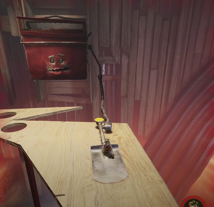
Recently, I started playing It Takes Two, and I'm blown away by the game interface, especially when you think about it in terms of designing for XR (space). What's striking is how seamlessly the interface integrates into the game environment, almost to the point of disappearing in the traditional sense.
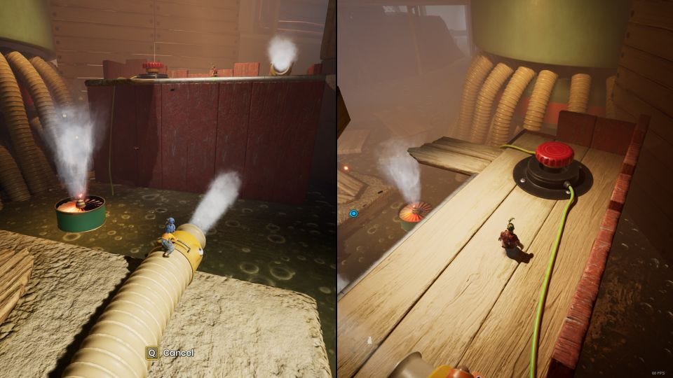
There are no distracting floating texts or fixed icons; instead, all indicators and interactive elements blend seamlessly into the surroundings, enhancing immersion and embodiment, elevating the overall gameplay experience.
Moment of revelation
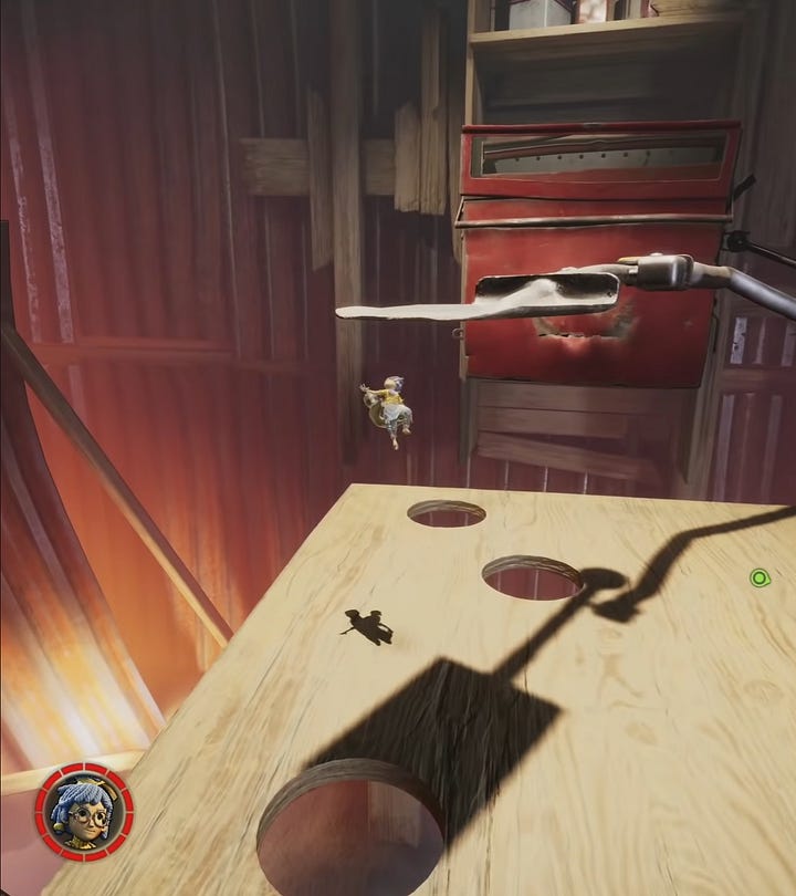
For me, it all clicked (nearly making me to tear up due to its exceptional design), was during the second boss encounter. The game effectively communicates danger and hazards through subtle cues, such as shadows of falling nails or shovels. On the other hand, elements crucial for player interaction and progression are highlighted in yellow, ensuring clear guidance amidst a pretty intense gameplay.


This may appear straightforward at first glance, yet it significantly surpasses the conventional digital UI, making the experience so much better.
Just look at this in the contrary, so much different.
But it doesn't have to be that way.
Alternative
Ghost of Tsushima has no fixed waypoints or minimap, instead it has a mechanic called "guiding wind". It is a navigational aid to help players discover the island, quests, treasures etc. without (again) breaking the immersion by being embedded in the environment. And there are many other similar examples out there, such as Elden Ring.
This is what the design for XR should be…
… not this.
All in all
Undoubtedly, digital UI and windows positioned in a space serve their own crucial functions. However, what distinguishes XR is its capacity to transcend conventional boundaries, offering canvas limited literally only by imagination. In the XR, the proverbial sky is not the limit; rather, it serves as a gateway to boundless creativity and exploration. This medium allows users to interact with experiences in entirely novel ways, whether by transforming their immediate environment or taking on journeys to entirely different worlds. It is this inherent potential that makes XR such a unique medium.
I strongly believe that by crafting interfaces that seamlessly blend with both the real and virtual surroundings, we can take the sense of immersion and embodiment within the experience even a step further. In doing so, we not only encourage users to lose themselves fully in these new worlds but also ensure that the UI serves as an aid rather than an obstruction or distraction.
I'm curious to hear your opinion about this. Let me know! :)
A collection of links and stuff I think are worth sharing.
A great case study of design choices in the game Synapse. https://www-roadtovr-com.cdn.ampproject.org/c/s/www.roadtovr.com/synapse-embodiment-immersion-inside-xr-design/amp/
Fantastic conversation with Haruko Hayakawa, I love all of her work! https://the-brandidentity.com/insight/is-it-just-us-or-are-cg-products-having-a-moment-we-asked-cg-sorceress-haruko-hayakawa-to-weigh-in
Hito Steyerl: Bubble Vision. I was recently recommended this lecture by one of my friends, and I can’t stop thinking about it ever since. https://www.youtube.com/watch?v=T1Qhy0_PCjs
Design like nature does. https://www.instagram.com/p/C4YnqNXtA4o/


